Client

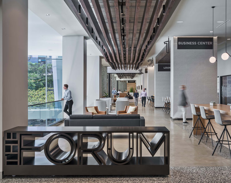
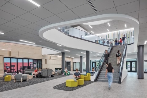
people can gather in the Exchange—a large, multi-functional space inside the Forum.
Project Connect
01 Challenge
Nearly 50 years after Fifth Third Bank planted roots at Fountain Square, our firm was invited to work on a complete transformation of their headquarters—also known as “Project Connect.” This three-year project was the capstone of a comprehensive overhaul of Fifth Third’s employee and visitor experience. Guided by an integrated team of architects, interior designers, and experiential graphic designers, this project prioritized design drivers around legibility, unity, and connection.
02 Solution
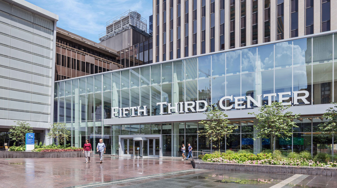
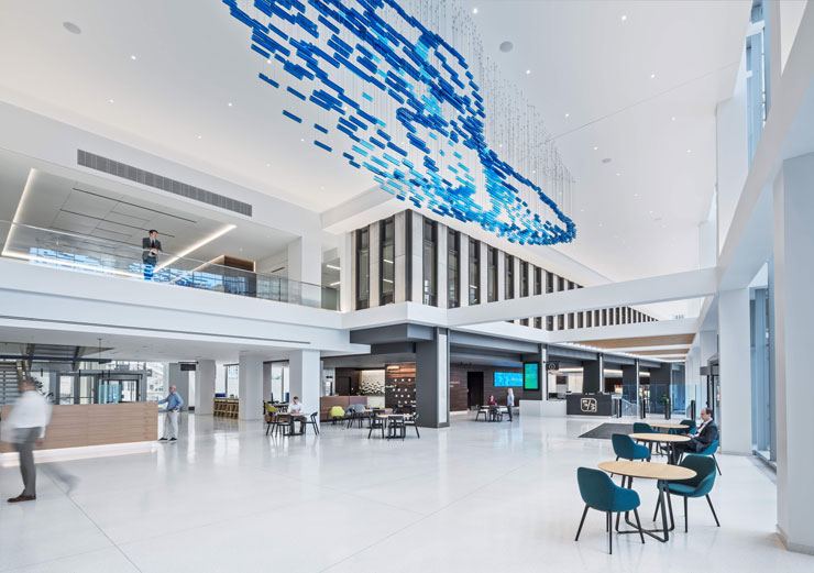
To improve the building’s legibility, we connected Fifth Third Center’s tower and the adjacent William Rowe Building—creating a primary front door that opens into a bright and airy atrium. Additionally, on the second floor of the building, we designed The Forum—a futuristic meeting and collaboration space designed for ideation and connection.
Quick Facts
Location Cincinnati, OH
Completion Date 2021
Size 50,000 SF
03 Results
Due to the collaborative nature of the large design team, project scope and design ideas were constantly evolving. Despite this, the team remained united and committed to the project vision. The result is a cohesive space that fulfills each and every design driver.
Increased Legibility
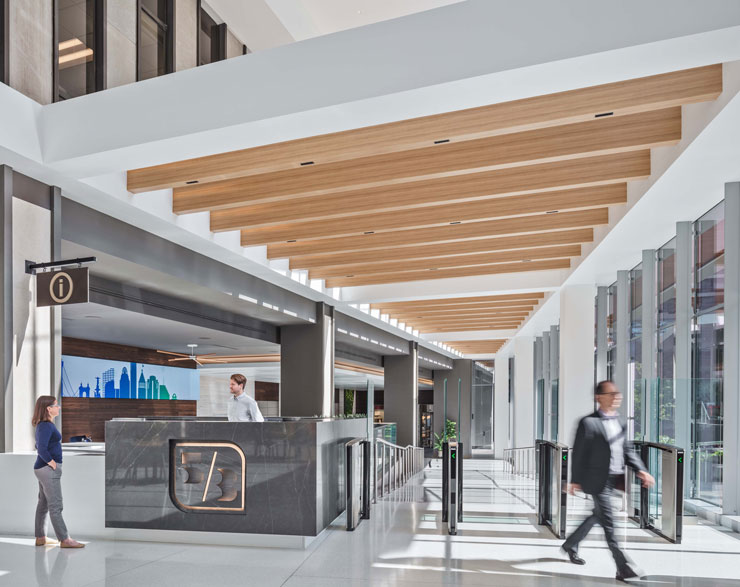
Previously, the campus layout was unintuitive and unclear; people did not know where to go and there was no recognizable entrance. Now, there is a central front door with clear exterior branding to define the building. Upon entering, a welcome desk is central to the lobby, enhancing security and providing people a prompt and warm greeting.
Improved Transparency
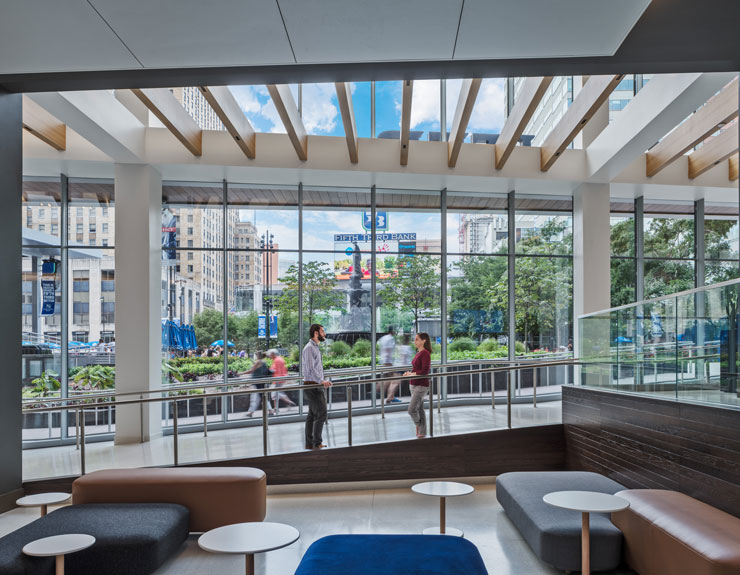
The atrium is a simple glass volume tailored to complement the minimalist architecture of the existing building. The primary feature is the glass curtain wall intent on improving daylight and maximizing sightlines into and out of the lobby space, reinforcing transparency between Fifth Third Bank and Fountain Square.
Tied to Community
The building is now literally—and figuratively—an outreach to the community. Customers who use the branch are also invited to enjoy the atrium, and the Forum is used for bank-sponsored community events. Community is also expressed through several graphic features—including an acrylic sculpture in the atrium that represents the community’s online activity.
Reinvented User Experience
A dedicated employee entrance welcomes team members into the space and greatly improves the entry experience for personnel. As employees walk toward the elevator bank, they see subtle hints of the Fifth Third brand, including greenery displayed on the wall in an angled fashion to represent the slash in their logo.
This project was about legibility, unity, and connection. The best thing about it is that it's fulfilling everything we set out to do and more.
Valerie Garrett, Vice President | Director of Workplace Design
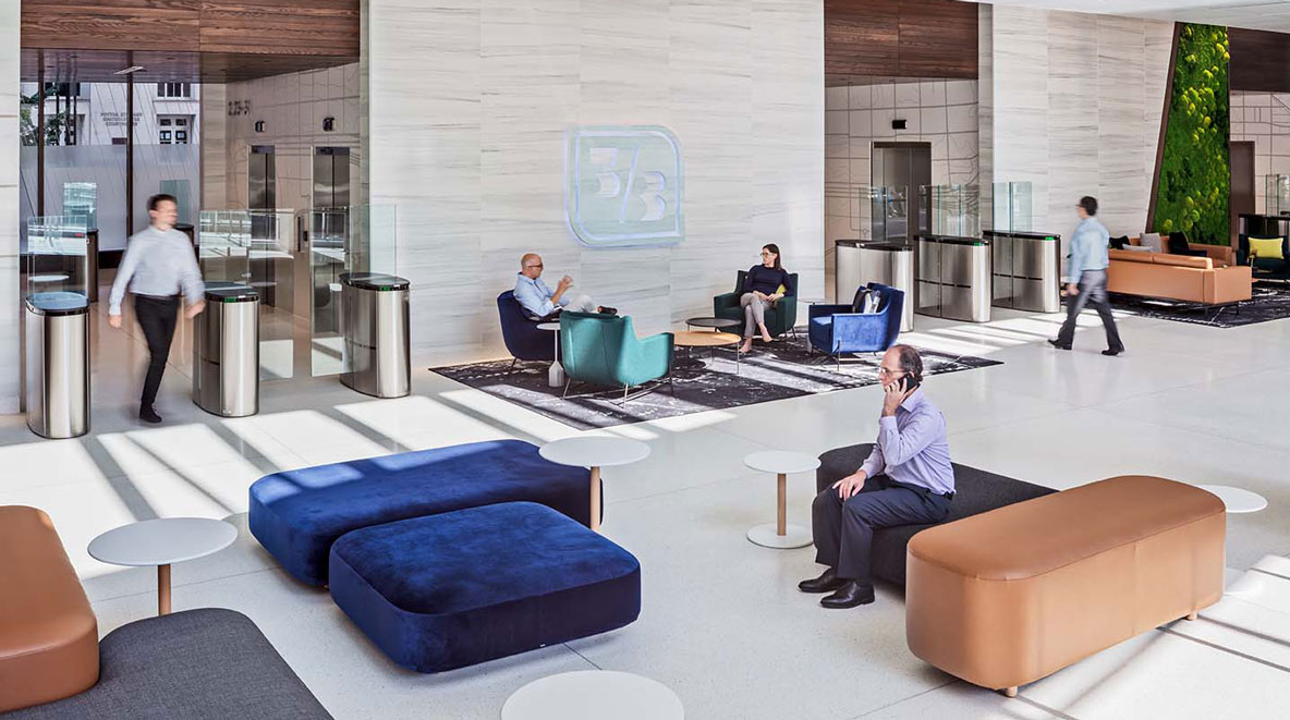 The designated employee entrance offers comfortable seating and places for people to gather before heading up to their floor.
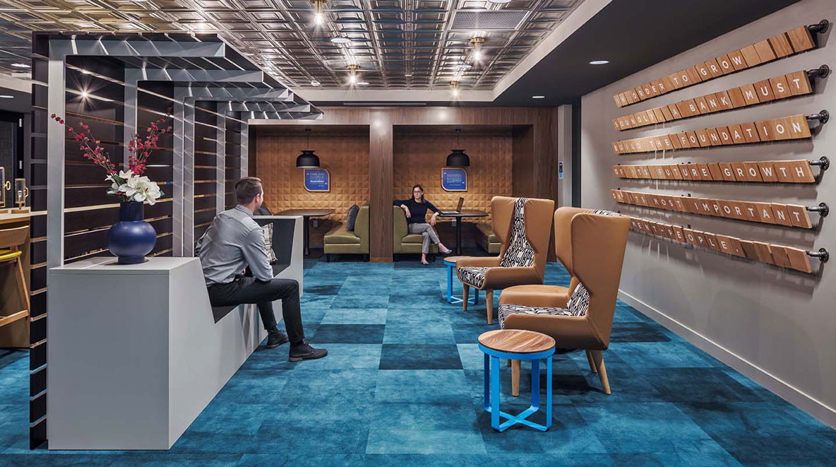 Inside the Forum, an original bank vault was reimagined to become a space for users to focus on their work in a unique setting.
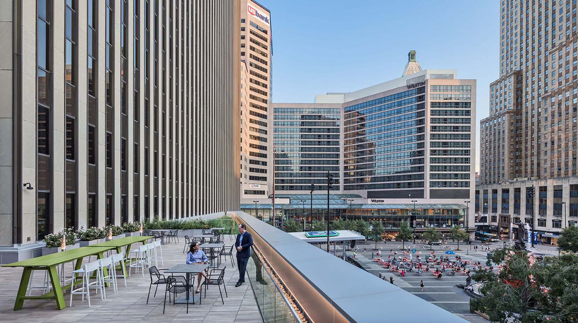 On the second floor, an outdoor terrace beckons employees to step outside and experience Fountain Square from a different perspective.
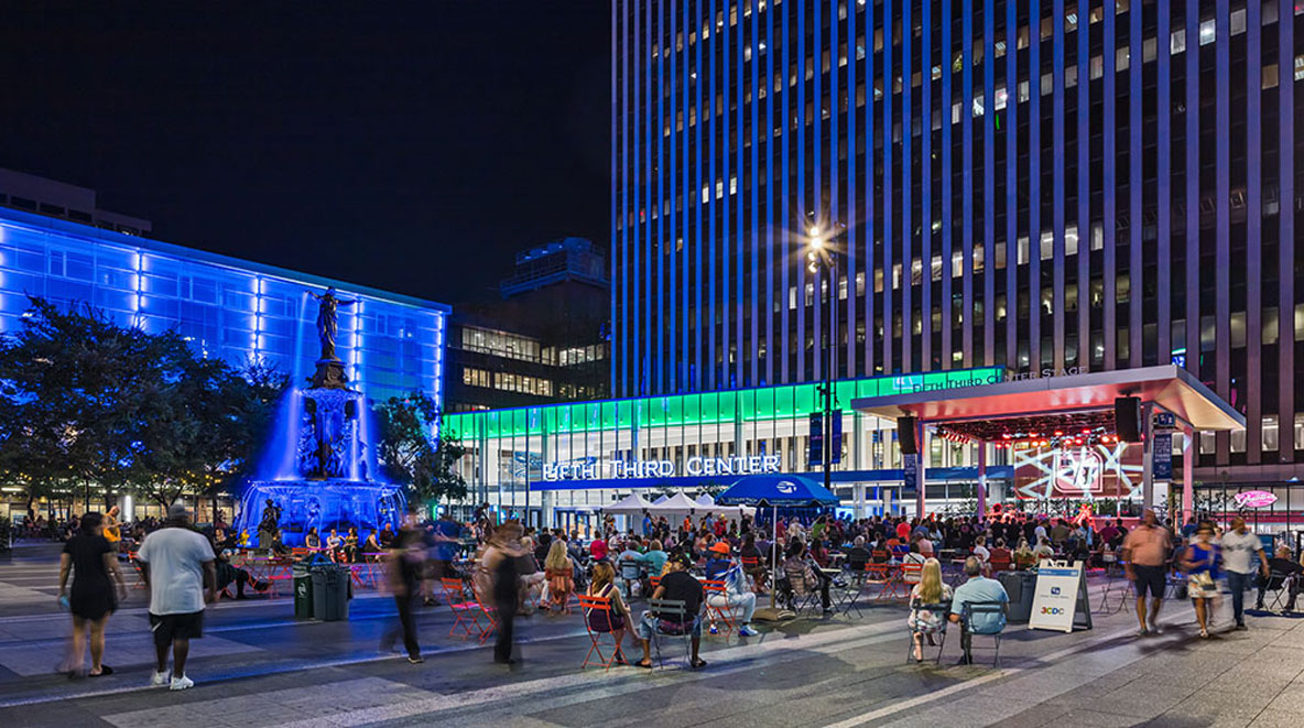 Project Connect also included a new, permanent performance stage to fulfill a long-term community objective for a state-of-the-art public venue on Fountain Square.

