Lessons Grocers Can Learn From Department Stores: Lesson Two—Visual Display
Using your products to tell a story is a powerful way to inspire the imagination of customers. Whether customized at the store level or handed down from the corporate office, visual displays inform shoppers about seasonal trends, brand lifestyles, or product benefits—and engender confidence and purpose.

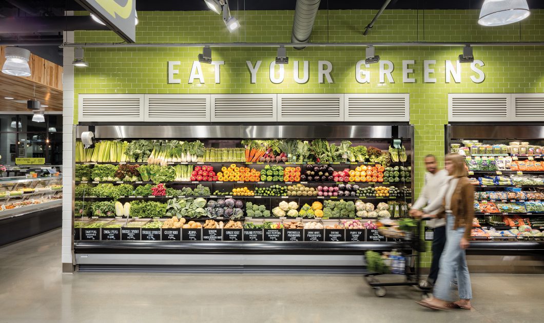
Grocery: The best that visual displays get in most grocery stores is an organized, stacked, branded endcap with a large price sign. Sometimes, there may be plastic plants hanging off the refrigerated cases.
Department stores: Department stores dedicate space for visual displays along with entire budgets and regional teams of visual merchandisers, who use mannequins, display tables, toppers, plinths, and banners.
Advice: Customers expect—and enjoy—having their imaginations engaged. Grocers should break free from traditional boundaries and tell cross-merchandising stories that combine apparel, home, and food. Set aside areas for dedicated displays and redefine your show window.
This is Lesson Two of “Lessons Grocers Can Learn From Department Stores.”
